How a Responsive Website Can Help Your Brand Grow In 2026
In 2026, mobile devices may dominate the way people use the internet. Moreover, customers can have higher expectations than ever. If your website is not working properly on all screens, you may lose your customers in an instant. Therefore, a responsive website for brand growth is no longer an optional feature but a necessity to take your business to new heights. It helps increase engagement and conversions while also building a strong online presence for your brand in this fast-changing digital world.

What Is a Responsive Website?
A responsive website is a site designed to respond and work properly on whatever screen you are using. Whether you use a desktop, a tablet, or a smartphone, the website automatically adjusts its layout to fit your screen properly. Instead of a site that stays stiff and forces you to "pinch and zoom" to read a sentence, a responsive site is fluid, making it feel like it was made specifically for the device you are holding in your hand.
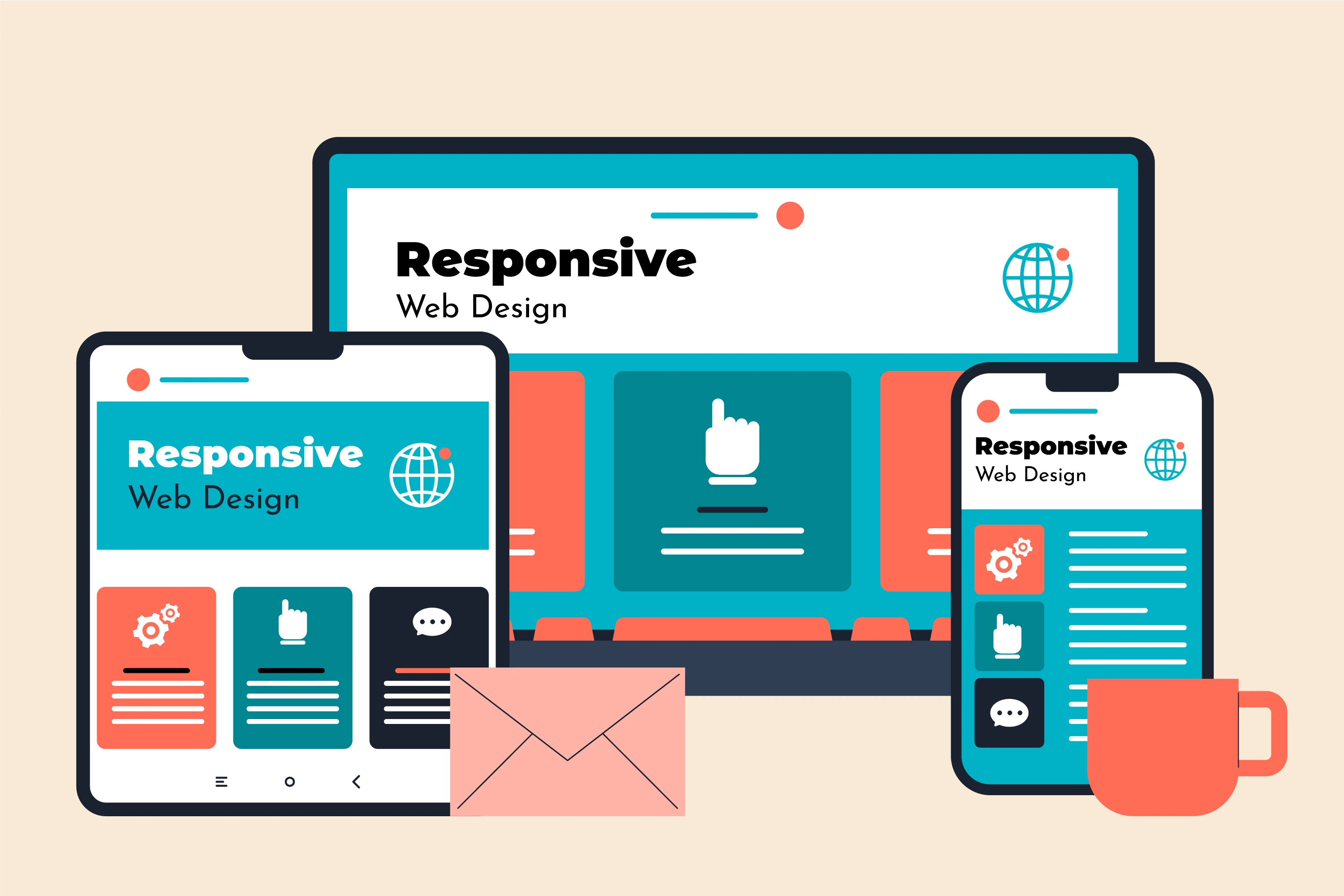
A responsive website can change its layout based on the screen size. On a computer, you might see three columns of information, but on a phone, those columns will stack on top of each other so you can scroll with your thumb. This makes it much easier to use and helps people find what they need faster. It also ensures that your brand looks professional on every single screen.
Why Every Growing Brand Needs a Responsive Website in 2026?
The online marketplace has never been more competitive. Nowadays, businesses without a solid mobile online presence are gradually losing their targeted customers. The responsiveness of a website has a direct impact on the satisfaction and loyalty of the customers. The brands that invest in responsive websites for growth have higher engagement, more time spent on the site, and higher conversion rates.
Additionally, search engines reward responsive sites with better ranking. Responsive design will not only help retain customers but also increase the brand's presence on a global level.
How to Make Your Website Responsive in 2026
The creation of a responsive website demands a strategic framework, careful planning, and the use of modern technology to ensure its compatibility on all gadgets. The concern is not limited to the appearance but also includes the functionality, performance, and user experience. The following methodologies ensure the website performs at its best.
1. Adopt a Mobile-First Approach
Mobile-friendly design helps to emphasize the core information and functionality of the content. The small screen real estate of mobile devices helps to eliminate visual clutter. The design will then be expanded to accommodate tablets and other desktop devices. This approach will ensure the website works effectively with various devices. It improves the overall user experience.
2. Use Modern CMS Platforms (WordPress, Webflow, and many more.)
The current technology in content management systems (CMS) has made it easier to implement a responsive design; for instance, WordPress or Webflow comes with responsive templates that make the process easier and reduce the chances of errors. Furthermore, the systems enable the updating of the content, design, or even the addition of new features without losing functionality. This will ensure that the website is fully responsive during the evolution of the brand.
3. Optimize Images and Code
Website performance is affected by the dimensions of the images and the quality of the code used. Larger images and poor code will affect the loading speeds of the website. The use of compressed images and better code improves the loading speeds of the website. Fast-performing websites will increase the user experience and reduce the bounce rate. In the global market, performance efficiency will greatly contribute to the retention of customers.
4. Conduct Continuous Testing and Performance Monitoring
A responsive website also needs constant evaluation. Since people use so many different devices, browsers, and operating systems, your content can sometimes look different depending on where it’s being viewed. Regularly testing your site helps you catch and fix these issues before they actually impact your users. By tracking performance, including page speeds, device usage, and user interactions, you get a lot of valuable data. Ongoing optimization is what ultimately keeps your site competitive.

How to Measure the Growth Impact of a Responsive Website?
By tracking specific metrics, you can assess the real value of a responsive website. A responsive website helps you understand exactly how it fuels your growth. These metrics also provide insights into the clear patterns in the behavior of users on your website. More importantly, you get a clear view of exactly how your responsive design fuels your overall performance.
1. Conversion Rate by Device
Comparing your conversion rates across different devices is the best way to spot specific strengths or weaknesses in your design. A truly responsive website should maintain a consistent conversion performance whether people are using it on a phone, a tablet, or a desktop. By closely monitoring your conversion rate across different devices, you can make many more adjustments to the layouts, buttons, and content to get the best possible results.
2. Engagement Rate
It’s one thing to get people to your site, but getting them to stay for a longer period of time is the real challenge. Pay attention to the real signs: how long are they sticking around, and are they actually clicking your buttons? These numbers aren't just data points; they're a direct reflection of your design. Usually, when engagement spikes, it’s because the site feels effortless to use and responds perfectly to whatever device they’re holding.
3. Page Load Speed
A website’s speed is basically its first impression. In a world where everyone expects instant results, a lagging page is a direct signal to your visitors that their time isn't being respected. You can check your vitals using tools like Google PageSpeed Insights or Lighthouse to see exactly where the bottlenecks are.
4. Mobile vs. Desktop Traffic Performance
Analyzing how your traffic patterns differ across various devices is the best way to prioritize improvements to your design and content. For example, if mobile users make up the bulk of your traffic but your conversion rates are lagging behind, you know exactly where to make targeted adjustments to bridge that gap. This kind of information ensures your responsive design is actually supporting your entire audience effectively.
Common Mistakes Brands Should Avoid in 2026

Even with a responsive website that is already set up, many brands still make mistakes that can end up limiting their growth and hurting their online presence. If these errors aren't addressed properly, they can quickly hurt your user experience, engagement, and conversion rates. Staying aware of these common errors is essential if you want to keep your website strong and competitive. Here is a look at some of the most frequent mistakes you should try to avoid.
1. Ignoring Mobile Performance
Some brands focus heavily on desktop experience while neglecting mobile optimization. Mobile users make up the majority of traffic nowadays. Failing to optimize for mobile can reduce engagement and conversions significantly.
2. Overloading Pages with Heavy Content
Sometimes, images may be too large, or the resolution of the videos/images may be too high. In some situations, the code may not be optimized. All this may lead to a slow response from the site. The aim here is to ensure the website content does not take too long to load while at the same time ensuring the information the visitor needs is available.
3. Skipping Cross-Device Testing
It is very risky to assume your site works perfectly just because it looks good on your own screen. A layout that is perfect on an iPhone can create some serious issues on a tablet or a foldable device. Regular testing across all platforms is important and is the only way to guarantee every visitor has a high-quality experience.
4. Not Paying Attention to Analytics and Feedback
If you're not tracking metrics like engagement or page speed, you won’t know whether your website is actually performing well or not. It is almost impossible to fix what you're not tracking. Continuously tracking analytics allows you to make smart, necessary adjustments that ensure you stay one step ahead of the competition.
5. Overcomplicating Your Navigation
A cluttered navigation system and messy layout can confuse visitors. A simple navigation system is not only beneficial for accessibility but will ensure that visitors are able to use your site without hassle. This later drives high retention along with conversion rates.
Future Trends in Responsive Web Design (2026 and Beyond)
Responsive web design is a dynamic field due to the ever-changing technology. Being up-to-date with the latest developments in the field of responsive web design is very important in order to remain at the top of the industry with an experience that matches the latest trends.
- Progressive Web Apps (PWAs): It is defined as a combination of the accessibility features found in websites and the functionality attributes found in applications. These application features can be included in responsive websites to improve user experience.
- AR/VR Integration Readiness: Augmented reality/virtual reality is slowly entering various sectors like e-commerce, training, and entertainment. The readiness of responsive websites to incorporate AR/VR can enable the integration of immersive experiences for users across the world.
- AI-Driven Personalization: Artificial intelligence-based tools can be employed to personalize content or offers on websites to specific users. This can improve the user experience of websites and increase the efficiency of meeting specific user requirements.
Conclusion
For business growth in 2026, having a responsive website has gone from being an advantage to something that every brand has to have. It is no longer just about making buttons that work on a phone; it is about creating a digital space that respects the user's time and choice of device. When a website adjusts perfectly to a screen, it does more than just look good; it builds the kind of smooth experience that turns visitors into customers. By focusing on mobile-first design and strong management platforms, businesses are doing more than following a trend; they are securing their future.
This is where Softbenz Infosys, a leading IT company in Nepal, adds value to your business. At Softbenz Infosys, we design responsive websites that don’t just look good; they convert visitors into customers. Our team builds fast, scalable, and mobile-first digital experiences that help brands grow in competitive markets. As a trusted System and Software Development Company in Nepal, we focus on delivering solutions that meet modern business needs. For other informative and helpful ideas about website and app development, you can explore the other blog posts on our site.
Recommended blogs:
- Features in E-Commerce Website That Every Nepali Business Must Have in 2025
- Custom Mobile App Development in Nepal: A Complete Guide for 2025
FAQs on Responsive website for brand growth
1. Does responsive design improve SEO rankings?
Yes, responsive design has a significant impact on search engine optimization. As search engines like Google favor responsive sites in search engine results pages, which helps to increase visibility. Also, responsive sites have low bounce rates, which is very important in improving their ranking. This shows that responsive web design is very important in digital marketing.
2. Is responsive design still relevant in 2026?
Mobile browsing is not just a trend anymore; it’s more about how most people actually live online. Users nowadays don't just "prefer" a seamless experience; they demand it. If a site feels broken or clunky on a phone, those visitors won't stick around to figure it out; rather, they will just head to a competitor. In 2026, staying competitive means having a website that feels native to every device. If it doesn't, you'll miss out on sales.
3. How does responsive design affect conversion rates?
Responsive design isn't just a feature; it's a conversion engine. When your site works perfectly on a phone, you're removing the barriers that usually make people leave. If a customer can't easily tap a "Buy Now" button or fill out a form because it's too small for their screen, they won't struggle; they’ll just quit. By making every button and link effortless to use on every device, you turn casual visitors into actual customers with much less effort.
4. What is the difference between responsive and adaptive design?
Responsive design can adapt to all screen sizes with flexibility, which ensures that the website works properly on every device. Adaptive design uses set layouts for particular devices, which may not include all screen sizes. However, with responsive design, there is wider compatibility, easier maintenance, and better long-term results for businesses that desire to maintain a consistent user experience.